Hey there Remodelaholic readers! Dawn here, from AD Aesthetic, and I’m back this month with another reader question mockup to hopefully inspire some creative ideas for your outdoor space. If you’ve missed any of my previous reader question mockups, you can always see all my posts here.
If you follow Remodelaholic on Facebook, you’ve probably seen several of the reader questions that are submitted every month. Well each month here on Remodelaholic, I choose one reader submitted photo to offer my two cents on, and I create a Photoshop mock up of what I would do if I were in your shoes! (Pssssst— you can submit your reader questions by messaging Remodelaholic on Facebook!)
First though, my disclaimer: While I can recommend ideas that I think look nice, I have never seen this house in real life and don’t have accurate measurements. I am also not an architect or landscaper and do not know the planting recommendations for your area- I just like to make things look nice. I can’t guarantee that any of the items I put in my ‘virtual’ design will actually work in real life (or that they’ll fit your design style for that matter), and this is not intended to be a professional design consultation. So think of this as a just-for-fun rendering that hopefully gets your wheels turning and provides some inspiration!
On to the fun!

READER QUESTION from Maggie — My family just moved into this lovely home and I need advice on how to spruce up the front a bit. Any suggestions? I was thinking I should remove the shrubs and plant flowers. Also thinking about having the whole front covered with stone…thoughts anyone? Thank you!!!
Firt off, congrats on your new place! Yay!! As far as ideas/suggestions for the front, that porch is NOT living up to it’s full potential! Searching around for inspiration, here are a few images I found that could lend some direction to my mockup for this home:

Image Source: Ottawa Citizen

Image Source: flickr | Photo Credit: Kuhl Design Build

Image Source: Archadeck Outdoor Living

Image Source: AJC.com

Image Source: Better Homes & Gardens
Mid-Century Modern Curb Appeal Inspiration
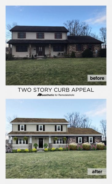
I love how each of these really plays up the front porch. They all have the same basic structure as the home we’re working with here, so it was helpful to see how they emphasized their best assets. Here’s what I came up with to give porch an inviting makeover:


Inviting Porch Curb Appeal Ideas
Play up the porch: Beefing up the columns would be the first thing I would do, and the one thing I’d do if I could just pick one. The skinny little columns on the current porch feel a bit off balanced, and give the porch a bare-bones look that isn’t as inviting as it could be. Giving them a face lift draws attention to the size of the porch, making it feel like a feature of the home, rather than an afterthought. To this end, I also added a classic white railing between columns to create a more private space and polish the porch even more.
Balance things out: The second thing I focused on was balancing out the weight of the second floor. Specifically, the off-centered windows. If it’s possible to add a fourth window to the second floor, that would go a long way towards giving everything a finished/balanced look. If not though, no worries. Enhancing the visual weight of the windows with some window boxes would also be a great way to give that second floor level some visual interest and weight.
Breaking things up: This home has some very harsh lines to it. Not necessarily a bad thing, but in this case, breaking out of those visual lines can provide the eye with a resting place that softens the feel of the exterior overall. To do this, I added a natural textured stone to the lower section of the house. This not only breaks up the strong vertical lines of the siding, but it connects the porch area to the section of the house that extends beyond the porch. Another trick I employed to break the lines was to add a peak to the porch roof. This breaks up the horizontal line of the porch roof, which when combined with the vertical lines of the house created a very harsh visual juxtaposition. Adding an angled peak connects the lower section to the upper section in a more natural and flowing way— gently guiding your eye from the porch up to the second level. It removes that overly boxy look and highlights the entrance to the home.
Adding some new landscaping (something a bit lower to allow the porch to shine) was the final step and my virtual makeover was complete. So what do you think? What would you do to up the curb appeal if this were your home?

As always, thank you to Cassity and the Remodelaholic team for having me back each month. If you like this post, and have a design dilemma you’d like me to mock up some ideas for, you can ask your questions by sending Remodelaholic a message over on Facebook, or checkout my mockup design services over on my site adaesthetic.com. And be sure to follow me on Facebook, Pinterest, or Instagram and say hello! Have a great day, friends!
-Dawn
More virtual curb appeal updates:
The post Real Life Rooms: Inviting Porch Makeover for Added Curb Appeal appeared first on Remodelaholic.
https://www.remodelaholic.com/real-life-rooms-inviting-porch-makeover-curb-appeal/


No comments:
Post a Comment